Web design analysis: government portals industry
USA government web site home page web design review.
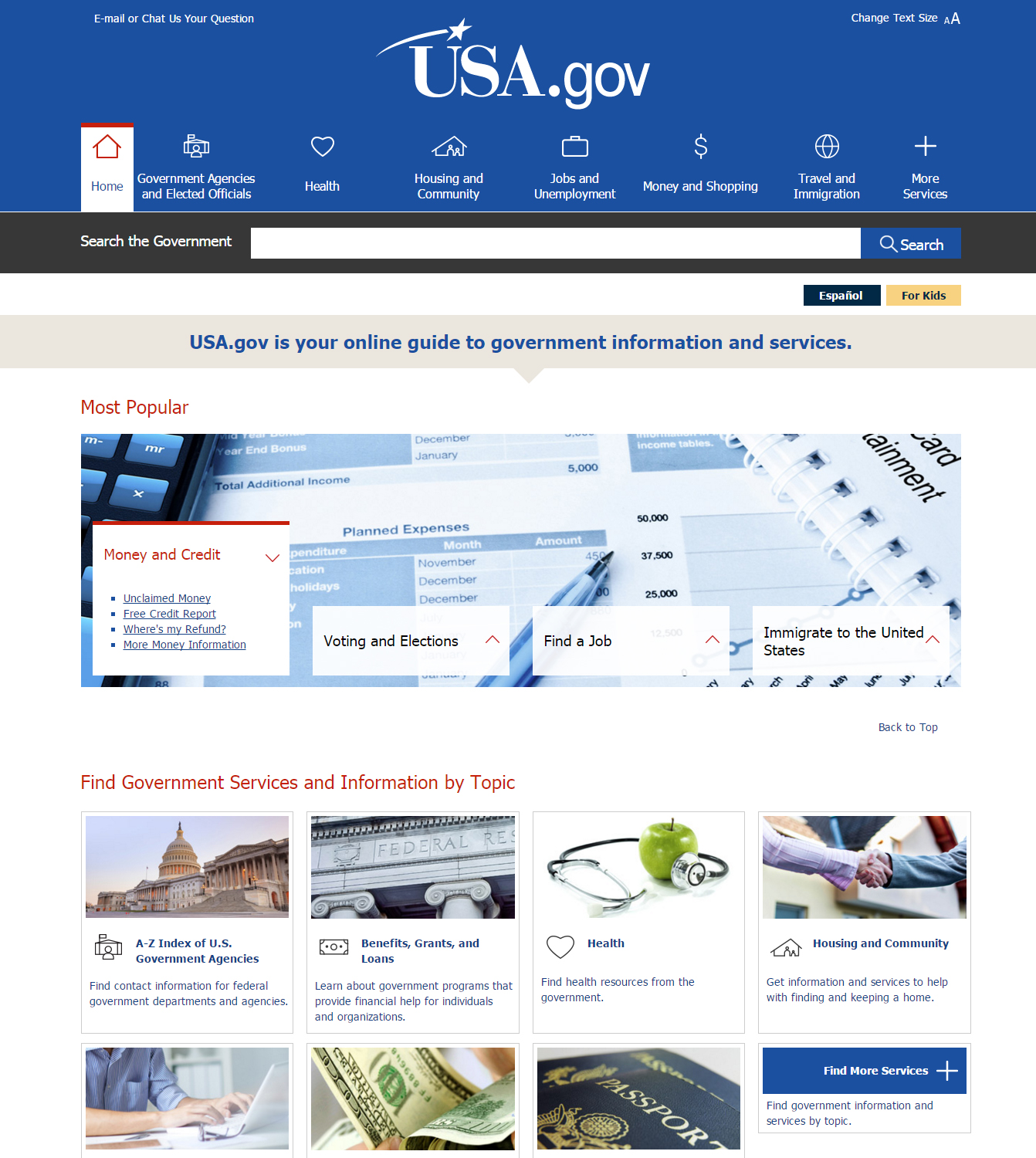
Screenshot
The analysis of this web site's design includes the assessment of the most important parts of web design: structural elements, layout, typography, graphics (e.g. logotype, buttons, advertisement banners), dimensions and other parameters. Besides that, a number of other aspects is evaluated. These include usability, simplicity, intuitiveness, trustworthiness, as well as general attractiveness.
Design structure
The web page consists of the following design elements:
- header
- main content
Header
Header is the upper part of a web site. Usually it serves as a place for the basic information about a company, for example a logotype and a motto.
The header of this particular web design includes the following:
- main menu
- logotype
- search field
- icons
- contacts
The logotype of the company is located in the centre of the page. It consists of the name of the company un an image. The logotype uses 1 colour:
- white
The logotype, as it belongs to a government, uses country-related symbols.
The background of the header is blue colour.
Main content
The main content is the part for the main information of a web site, e.g. for product descriptions.
The main content of this web site contains:
- content text
- images
- additional menu
- icons
The background of the main content is white colour.
Navigation
Navigation is a tool that allows users to visit different parts of a web site. Navigation can be implemented both as a separate menu and as links located inside the content. The design of this site uses 3 menus or navigation panels.
Hyperlinks are visually highlighted, using underline and blue colour.
Content layout
There are several layout types:
- one column - all the content is located in one unified space
- two equal columns - all the content is divided into two equally wide columns
- two different columns - a web page is divided into two columns, where one is more narrow than the other one. The wider column is usually assumed to be the main one, and the more narrow one - an additional column that is usually called a sidebar. If the more narrow column is located to the left of the main one, it is called a left sidebar, if it is located to the right - right sidebar
- main column and two additional ones - the central column is considered to be the main one, while the two narrower columns are additional. Another name for this layout is a layout with left and right sidebars
- multiple equal columns - all the content is divided between multiple columns of equal width
- upper block and columns below - a web page is separated in at least 3 parts: an upper part and multiple columns below
- bottom block and columns above - a web page is separated in at least 3 parts: a bottom part and multiple columns above
This particular web design layout divides the page into multiple blocks. The design does not use any additional elements that would affect the layout of the page.
Typography
The design of the web page employs 1 font. The typography of the web site is internet-friendly. It means that all the fonts belong to the internet-friendly fonts that are automatically installed on many operating systems. Internet-friendly fonts are correctly displayed on the majority of computers and browsers.
The fonts of this design are are easily readable. Readability is determined by the font type (internet-friendly/unfriendly) and size.
Graphics
The design of this web page also uses other graphics.
These graphics are:
- images
The graphics mentioned above are primarily used to illustrate, connect with other sites or parts of the web page, present. the web site's content.
Dimensions
The web site uses semi-flat design. It means that generally the design looks flat, although separate elements can be three-dimensional or all the content can be separated into several planes, while each of them is still flat.
The semi-flat design is a compromise between the flat and 3D design. It present information in an easy and user-friendly way, while still allowing the site to stand out and be original.
Additional elements
In addition to the main elements, the web site also uses additional elements, the aim of which is to enhance the user experience and better present the necessary information. These are:
- image descriptions
General parameters
Judging by the looks of the web site, its web design is adaptive or responsive. This means that the size of the design elements and/or their layout changes according to the size of the screen. In other words, the design adapts to the screen size. Adaptive or responsive web design allow a page to be displayed correctly on any device.
The web design does not employ special methods of attracting users' attention and motivating them to perform certain actions.
Usability
The main aim of any web site is to ensure a pleasant user experience, as well as to motivate users to perform certain actions. All these aims are achieved through the skillful use of web design. In order to do so, the design must be:
- simple
- intuitive
- trustworthy
- generally attractive
Simplicity
The web design of this site looks quite simple. It means that the design helps users to perceive information, or at least does not trouble to do so. Information is presented in a clear and structured way, and user can immediately see all the necessary information, as well as understand, which information is primary, and which is secondary. Also, the user's attention is drawn to the content, not to the design parts that should not draw attention. The design does not contain unnecessary elements that do not provide information or decoration, or that make using of the site more difficult.
Intuitiveness
The site's web design looks intuitive enough. It means that the design helps the user navigate through the site and look for information effectively, not wasting time for thinking about where a particular information might be located. A new user, most probably, will have no problems locating the information needed.
Trustworthiness
This particular web design looks trustworthy. It means that the design makes the user trust in the web site. The page looks modern and is not overflowed with advertisements. Its content is relevant to the supposed area of activity of the site and looks well-founded and structured. It gives the sense that the owner of the page did not spare money and/or skill in developing the site, which implies that the company itself is respectable and trustworthy.
Attractiveness
In general, this web design looks looks attractive. It means that, disregarding the site's ability to function properly and achieve other goals, it looks generally attractive. The web design leaves a favourable impression on the user, as the colours are pleasant or neutral at worst, and the layout looks appropriately balanced.
Valuation
Generally, this web design has the following strengths:
- modern looks
- quality images
- colours that also symbolize the country